Archive Website Redesign
Amplifying eight decades of craft: redesigning William Keyser's archive website

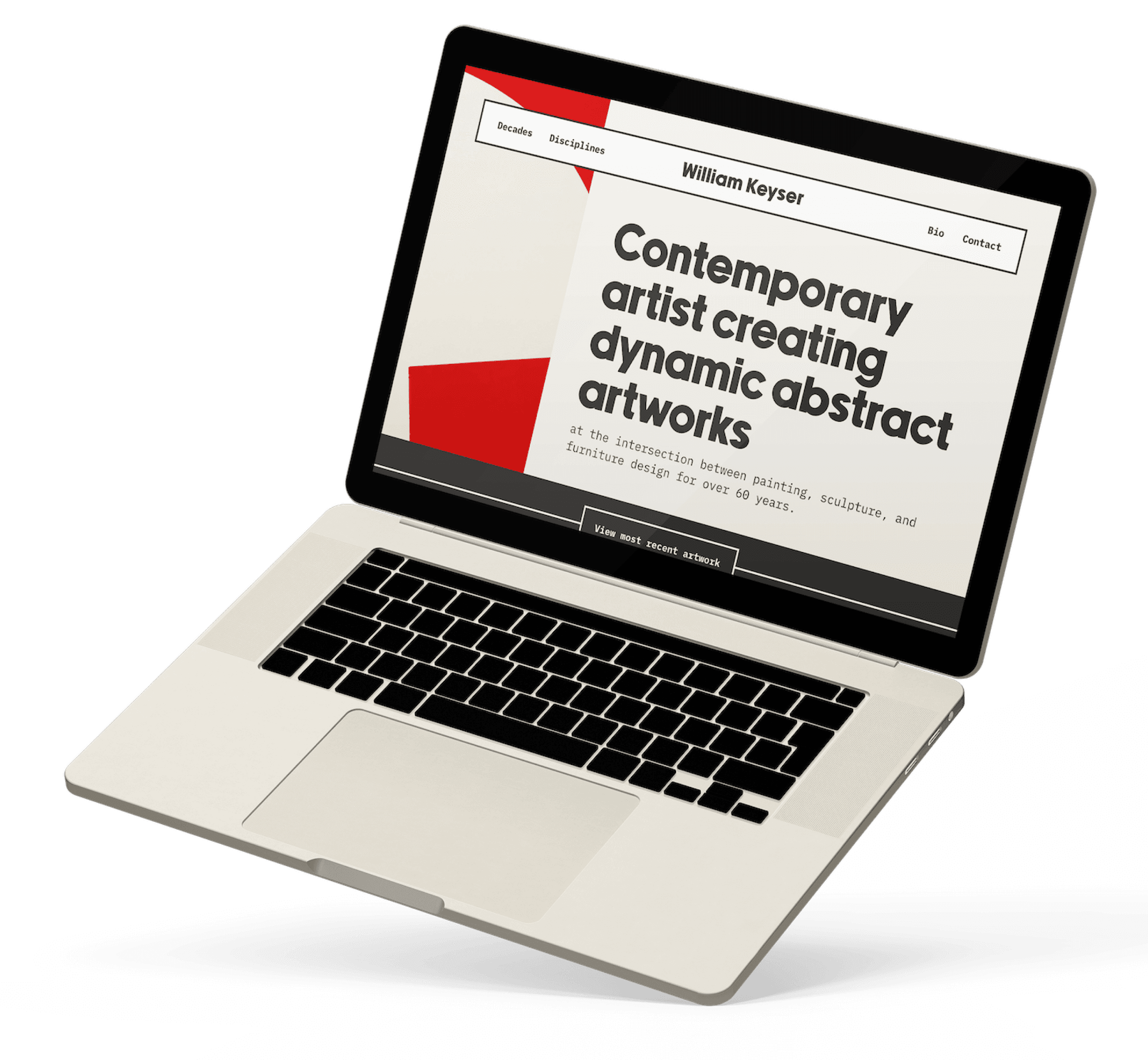
A redesigned website for artist and furniture designer William Keyser, organizing a 200-plus-piece archive spanning eight decades and four disciplines with a site that matched the craft and polish of his physical work.
Role
Web Designer, Brand Designer, Low-Code Developer
Team
Solo (Freelance Work)
Tools
Figma, Webflow
Visit the Live Site
Context
William Keyser is a master at his craft, decades in the making. His website was underselling all his hard earned expertise.
research
His designs follow consistent patterns. His archive kept burying his earliest work.
An understanding of the problem came from close collaboration with William directly and an in-depth study of the archive itself.
What visual patterns recur in Keyser's work?
With careful observation, I reverse engineered the design principles that connected his many pieces, so I could follow the same principles he already uses, rather than impose my own.

Dynamic
Sweeping, jutting lines and energetic shapes recur across his work. He manages to express movement in forms that are, physically, standing still.
Structural
His woodwork is planned and built for structural integrity. Even his paintings carry that same quality, often incorporating structural materials like metal and wire mesh alongside paint.
Geometric
Interesting geometric forms take center stage throughout his work. He rarely employs the use of filigree or organic ornamentation, and the lines he uses in paintings are often clean, opaque, and uniform in width.
How Can the Architecture of the site be improved?
I mapped how far a visitor had to scroll to view the work at the bottom of each page to understand how the current archive page architecture could be improved.
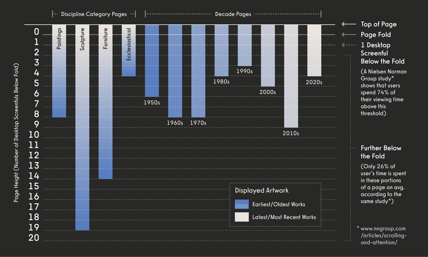
Oldest work was buried under the friction of numerous scrolls
The real cost of the original website's discipline-only structure is that, on desktop, reaching Keyser's oldest sculpture pieces took as many as 19 screenfuls of scrolling. This unnecessary friction is only amplified on mobile screens.
Because the archive will only grow, the effort required to get to the bottom of the page and the number of pieces being buried would only increase over time.
Key Decisions
01.
Decade pages, alongside discipline categories.
Mapping scroll depth showed that reaching Keyser's earliest sculpture work took as many as 19 scrolls on desktop, causing friction that would only get worse as more work was added.
I introduced a second way to browse (by decade) so visitors could follow how his style evolved over time, not just see it sorted by type. This lowered the barrier to finding his early, easily-overlooked work and gave the archive a sense of narrative that was missing on the original site.
02.
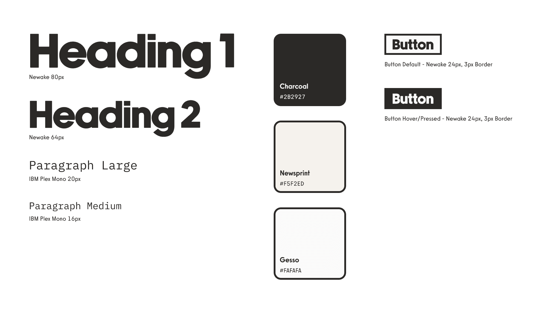
A near-achromatic palette designed to get out of the way.
I paired slightly faded neutrals with a warm, newsprint-like tan (deliberately avoiding true black, white, or grey) to keep focus on the color and texture already present in the work, while still giving the site an inviting gallery-like atmosphere.
For typography I paired IBM Plex Mono's functional reliability with Newake's classic form, echoing the same tension between function and form that defines Keyser's furniture.
03.
UI elements inspired by his own work.
The patterns I found through studying his archive (dynamic, structural, and geometric) were used as design principles as I designed the website’s interface.
Thick contrasting borders and dynamic geometric shapes in the page layouts echo those same structural and geometric motifs found across his artwork, furniture, and ecclesiastical pieces, giving the UI a custom, considered feel without competing with the work it is showcasing.
Impact
William now feels genuine confidence sharing his work online. For the first time, his site matches the caliber of design he's spent eight decades instilling in his own furniture and artwork.
That shift also shows up in how visitors respond, like this unsolicited note he received in his email inbox shortly after I pushed his new site live.
Visit the Live Site
"I feel fortunate to see your work through this website which is a tribute to your creativity, intelligence, and growth over time... The website is terrific! Navigation is intuitive and robust."
— Stephanie (unaffiliated visitor)